

In the ever-evolving digital landscape, the demand for mobile-friendly websites is higher than ever. With the rise of smartphones and tablets, more people are using mobile devices to browse the internet, shop online, and interact with businesses. This trend is expected to continue as mobile usage grows at an exponential rate. If your business doesn’t have a mobile-responsive website, you could be missing out on valuable opportunities.
But what exactly does it mean to have a mobile-responsive website, and why is it so crucial for your business? In this blog post, we will dive into the reasons why a mobile-responsive website is essential for your business’s success and how it can help improve your online presence, engagement, and conversions.
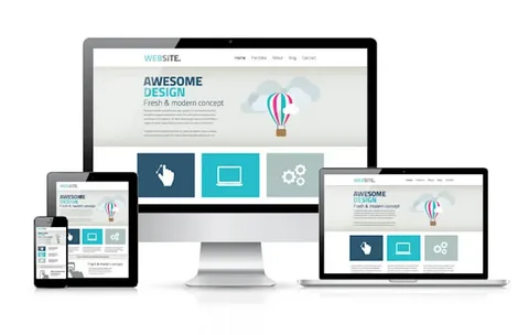
What Is a Mobile-Responsive Website?
A mobile-responsive website is a site that adjusts its design and layout based on the size of the device being used to view it. Whether a customer is browsing on a smartphone, tablet, or desktop computer, a mobile-responsive site ensures that the user experience is seamless, with no need for pinching, zooming, or horizontal scrolling. The content, images, and buttons adjust automatically to fit the screen size, providing a smooth and optimized experience.
Responsive web design is essential for businesses looking to stay competitive in today’s digital environment. It is not just a trend but a necessary feature that aligns with how users engage with the internet.
- Improved User Experience
User experience (UX) plays a crucial role in the success of any website. If visitors are forced to zoom in and out or scroll sideways to read your content, they will quickly become frustrated and leave your site. This negatively impacts your bounce rate and, ultimately, your conversion rates.
On the other hand, a mobile-responsive website ensures that your content is easily readable, and your website navigation is smooth and intuitive, regardless of the device being used. This positive user experience encourages visitors to stay longer, explore your products or services, and engage with your brand.
- Better SEO Ranking
In today’s competitive online environment, appearing on the first page of search engine results is vital. Google, the world’s most widely used search engine, prioritizes mobile-friendly websites in its ranking algorithms. In fact, Google uses mobile-first indexing, which means that Googlebot predominantly uses the mobile version of the content to rank websites.
By having a mobile-responsive website, you are more likely to achieve higher rankings on Google and other search engines. This, in turn, drives more organic traffic to your site, increasing visibility and providing more opportunities to convert visitors into customers.
- Increased Mobile Traffic
As mentioned earlier, mobile usage is on the rise. According to Statista, over 50% of global website traffic now comes from mobile devices. This trend is expected to continue as smartphones become more affordable and widespread, especially in emerging markets.
If your website is not mobile-friendly, you are missing out on a massive segment of potential customers. A mobile-responsive website ensures that you are providing an excellent experience for mobile users, capturing this growing audience and keeping them engaged with your brand.
- Faster Load Times
Mobile users tend to be more impatient than desktop users, especially when browsing on the go. A slow-loading website can lead to high bounce rates, which can negatively impact your business’s reputation and visibility.
A mobile-responsive website typically loads faster because it is optimized for mobile devices. By streamlining images, scripts, and other elements, a responsive website ensures faster load times, leading to a better user experience and a higher likelihood of retaining customers. Google also considers site speed as a ranking factor, so faster load times can help improve your website’s SEO.
- Higher Conversion Rates
Having a mobile-responsive website can significantly improve your conversion rates. Whether you are selling products, collecting leads, or encouraging visitors to sign up for a newsletter, a mobile-responsive website makes it easier for users to take action.
Mobile users are more likely to make purchases or engage with your content when the process is easy and seamless. A responsive website ensures that your calls to action, forms, and checkout pages are optimized for mobile devices, making it more convenient for users to complete their desired actions. As a result, your business is more likely to convert mobile visitors into paying customers.
- Cost-Effectiveness
In the past, businesses had to create separate websites for mobile and desktop users, which could be time-consuming and costly. However, with responsive web design, businesses can have a single website that works seamlessly on all devices. This reduces the need for multiple website versions and makes it more affordable to maintain and update your site in the long run.
Additionally, responsive web design eliminates the need for a separate mobile app, saving your business both time and money. It also simplifies the management of your website, as all updates are made to one version of the site rather than multiple versions.
- Competitive Advantage
Having a mobile-responsive website gives your business a competitive edge. If your competitors’ websites are not mobile-friendly, you have the opportunity to stand out by providing a superior user experience. Customers are more likely to choose a business that offers a seamless experience across all devices, and being mobile-responsive helps you earn their trust and loyalty.
If your website isn’t mobile-responsive yet, now is the time to make the switch. With more people browsing the internet on their smartphones and tablets, businesses that fail to adapt to mobile-first design risk falling behind in the competition.
- Enhances Local SEO
Mobile searches often have local intent. For example, a customer may search for a nearby restaurant, service provider, or store while on the go. If your business isn’t optimized for mobile, you could miss out on these local searches.
A mobile-responsive website ensures that your business can be easily found by users searching on their smartphones for services in your area. By improving your local SEO, you increase your chances of attracting local customers and driving foot traffic to your physical store or location.
- Adaptation to User Behavior
Consumer behavior has evolved, and people now expect websites to function seamlessly on their smartphones, tablets, and desktops. Businesses that don’t meet these expectations risk alienating potential customers.
A mobile-responsive website adapts to how users interact with your site, whether they are browsing at home, commuting, or waiting in line. By providing a website that works well on all devices, you cater to your audience’s needs and ensure a positive experience, leading to more repeat visits and customer retention.
- Long-Term Sustainability
As technology continues to advance, the importance of having a mobile-responsive website will only grow. Businesses that invest in mobile-friendly design today are future-proofing their online presence. By ensuring your website works well on any device, you are setting your business up for long-term success.
At LogoGeez, we understand the importance of a strong online presence. If you’re looking to update or build a mobile-responsive website, our team of experts is here to help. We offer affordable and professional web design services tailored to your business’s needs. For more information, visit our website at www.logogeez.com or call us at 212-516-8531. We’re here to make your business stand out online.
Conclusion
A mobile-responsive website is no longer optional for businesses; it is a necessity. With the increasing use of mobile devices and the rise of mobile-first indexing, ensuring that your website is mobile-friendly is crucial for staying competitive, improving SEO rankings, and providing a better user experience.
By investing in a mobile-responsive website, your business can improve traffic, enhance conversion rates, and ensure long-term growth. Don’t wait until it’s too late—start optimizing your website for mobile today and reap the benefits of a stronger, more engaging online presence.
For businesses that want to stay ahead of the curve and ensure their website performs optimally on any device, reach out to LogoGeez today. We’re ready to help you create a mobile-responsive website that will elevate your brand and drive more success.